
最近出现的一了网站叫做TheTrueSize.com (真实大小) 的网站,把错误的地图修正,让我们看到每个国家的真正大小。
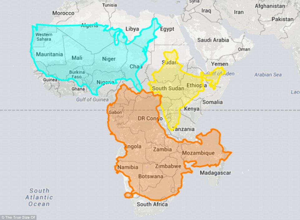
在以上的地图中,你可以看到可以把美国、中国、和印度都塞到非洲里。
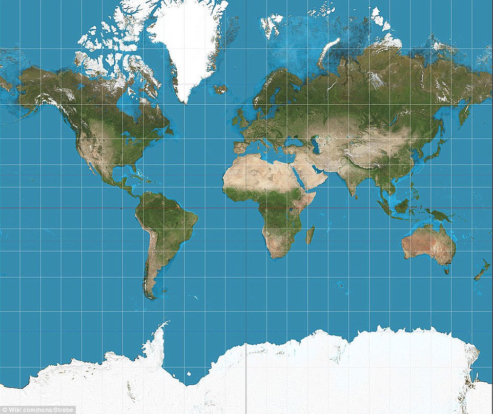
我们大多数所习惯的「横麦氏投影地图」是一名佛兰德的地图制作者在1569年制作的地图 (连Google Maps都是用这个),但这个地图的每个国家的大小其实错得很离谱。
当你使用TheTrueSize.com时,你就可以看到可以把一整个美国、中国、印度塞到非洲里…原来非洲这么大!而且还有多余的空间呢!
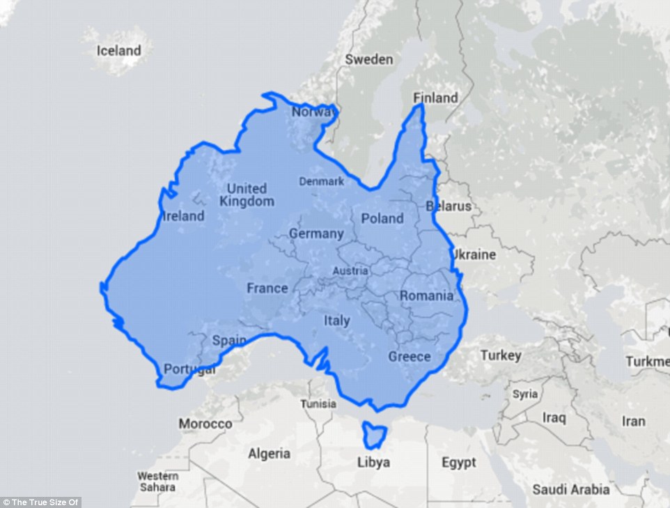
澳洲也是大约整个西欧的大小。
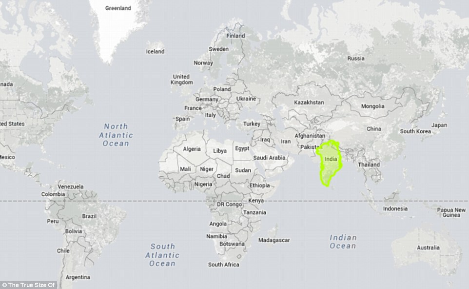
而印度的大小其实快要是整个欧洲的大小。

美国3个最大的州被放在非洲上,就变得好小…

结果发现到中国和美国的大小真的非常接近。

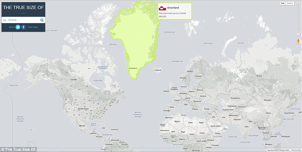
利用错误的「横麦氏投影地图」,格陵兰 (只有80万平方英哩) 看起来跟非洲 (1160万平方英哩) 一样大…非洲是格陵兰的14倍!
所以你就知道我们所知道的地图错得有多么夸张了?
不过真相是,格陵兰还比印度小一点。而只有跟非洲里的一个国家一样大…现在你就知道有多么离谱了吧?
那我们来看看台湾好了…基本上大小是韩国的一半。

或是希腊的2/3。

如果放在非洲上的话,不仔细看可能还看不到呢!

也大约是美国佛罗里达州的一半。

马来西亚则是跟日本差不多一样大。

而香港呢,就跟夏威夷的檀香山差不多一样大。

来源:DailyMail | TheTrueSize
看完后是不是觉得之前的世界观都被推翻了?这知识真的太重要了!没想到我们一直以来看的地图是错的!快分享让朋友知道!

 留言按此
留言按此
(往下還有更多精彩文章!)